
Table of Contents
The thumbnail that looked fine—until I saw it was small
I have made this mistake myself more than once. I make a thumbnail on my laptop. Full screen, it looks good. The colors look okay, the photo looks clear, and I can read every word. So I upload the video and move on.
Then later I open YouTube on my phone. And there it is—tiny. Dark. I can barely make out what the picture even is, and the text I was so happy with? Gone. At that small size it is just a blur.
That is the problem nobody tells you about. You design big. Your viewer sees small. In search, a thumbnail is shown at roughly 168 × 94 pixels. In the mobile feed it is even smaller, around 120 × 68. What looks clear on a laptop can completely fall apart down there.
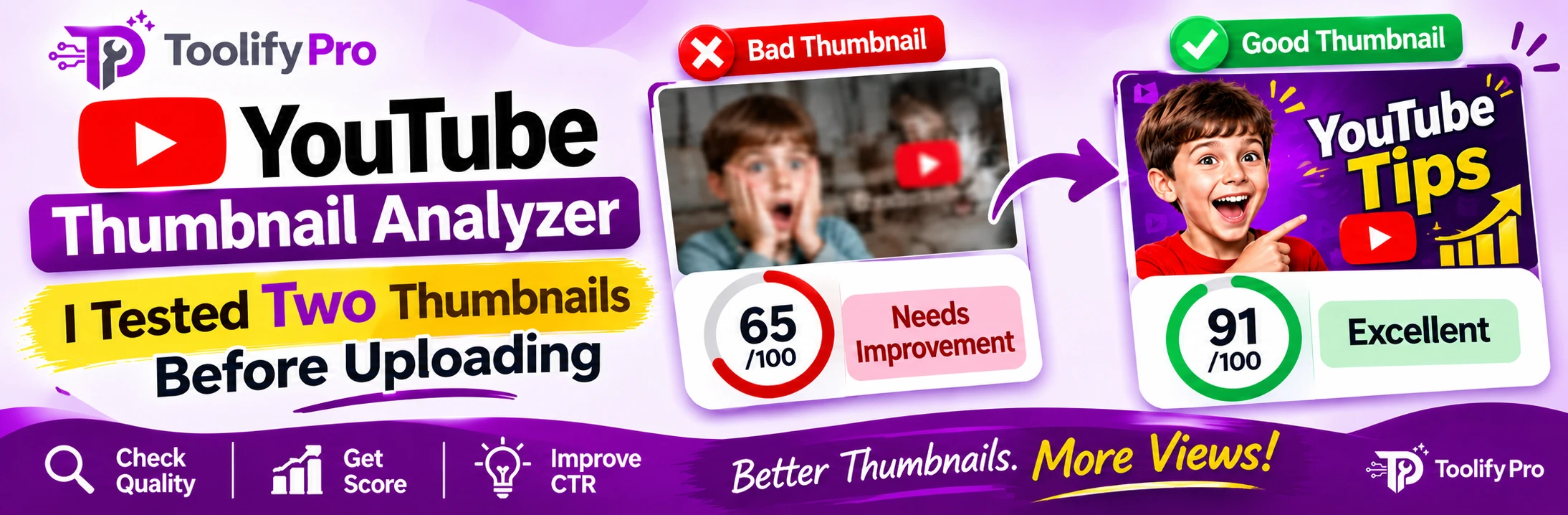
So now I check before I upload. Not after the video is already live and getting fewer clicks than it should. Before. For this article, I did not just write about the tool in theory. I actually ran two thumbnails through the free YouTube Thumbnail Analyzer on ToolifyPro and wrote down exactly what it said. Real scores. No guessing.
Test 1: The dark one—65 out of 100
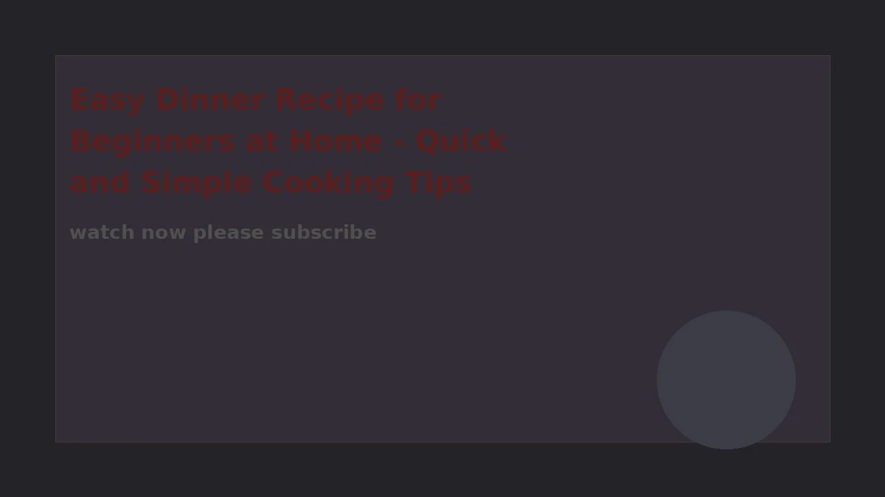
The first thumbnail was the kind I described above. Correct size, 1280 × 720. Nothing obviously wrong with it when you look at it big.
The tool gave it 65/100. Grade C. “Needs improvement.” And its message was blunt: “This thumbnail has a few issues to fix before publishing.”
Fair enough. When I read the details, I could see why:
| Check | Score | What the tool said |
| Brightness | 31 | “The image is very dark.” |
| Contrast | 12 | “Low contrast—elements may blend together.” |
| Sharpness | 3 | “Image appears blurry or soft.” |
| Saturation | 39 | “Colors look dull/desaturated.” |
The warnings were the part that stayed with me. It said the thumbnail is quite dark and may look muddy on small screens. That low contrast means text and subjects may be hard to distinguish. And it flagged the blur too—avoid upscaling or heavy compression, it said.
Here is the interesting bit, though. A lot of things passed with a full 100: resolution, aspect ratio (perfect 16:9), file size (only 0.02 MB), colour diversity, file format, edge safety, and color balance.
So the size was perfect. The file was perfect. And still it scored 65.
That was the lesson for me, honestly. Getting the size right is only the starting point. If the image is dark and soft, the correct size will not save it.
Its advice was simple and practical: brighten the image or add lighter elements in the background, increase the contrast between the subject and the background (or add a bold outline to the text), lift the saturation a little, and start from a higher-resolution source instead of compressing it again and again.
Its checklist failed on exactly three things: not too dark, sufficient contrast, and not blurry. Everything else passed. Three problems—but they are the three that matter most on a phone screen.
Test 2: The bright one—91 out of 100
The second thumbnail was a different story. Bright yellow background, big clear words: “EASY DINNER.” Also 1280 × 720, also made for a normal YouTube upload.
This one scored 91/100. Grade A+. “Great thumbnail.” The tool said, “This thumbnail meets most YouTube best practices.”

| Check | Score |
| Resolution | 100 |
| Aspect ratio (perfect 16:9) | 100 |
| File size (0.07 MB) | 100 |
| Contrast | 100 |
| Saturation | 100 |
| Sharpness | 100 |
| Colour diversity | 100 |
| File format | 100 |
| Edge safety | 100 |
| Brightness | 71—slightly off-target |
| Color balance | 0—a color tint is present. |
Notice the difference. Contrast 100 here against 12 in the first test. Sharpness: 100, against 3. That gap—that is basically the whole story of these two scores.
And yet, even the good one was not perfect. I liked that. It did not just praise it and stop.
Brightness was 71, a little off-target. And color balance was 0, which sounds dramatic, but the reason was specific: “A color tint is present—check white balance.” The warning said a noticeable color cast was detected, so the image may look off-balance. In its checklist, everything passed except one line: “No strong color cast.”
Its only recommendation was to correct the white balance to remove that tint before publishing. One fix. That is a very different position to be in than the first thumbnail, where I had four things to repair before I could even think about uploading.
How I use it now—4 simple steps
Step 1. Open the YouTube Thumbnail Analyzer
Step 2. Drag and drop your thumbnail in, or click to upload it. JPG, PNG, and WEBP all work.
Step 3. Read the score and, more importantly, read the reasons under it. Fix the lowest scores first. In my first test, that meant brightness and contrast, not the size—the size was already fine.
Step 4. Upload the fixed version again and check the new score. I do this until the big problems are gone. It takes less than a minute.
No sign-up. No payment. Both of my tests gave me the score straight after upload, and everything runs in the browser—my images were not stored on a server.
How to read your score—the honest version
After doing these two tests, this is how I read the scores in my own head:
| Score | How I read it |
| 90–100 | Technically clean. My 91 still had one tint to fix, so read the notes—but you are close to ready. |
| 75–89 | Good base. Usually one or two things to correct, like brightness or color balance. |
| Below 75 | Stop and fix the basics first. My 65 looked fine big, but it was dark, low contrast, and blurry—exactly what fails small. |
Now, one honest point, because I do not want to oversell my own tool.
The analyzer scores technical qualities—brightness, contrast, sharpness, saturation, size, ratio, file size, and things like that. It did not give me a separate score for text size in either test. What it did show me was the small previews—the search size and the mobile-feed size—and honestly, looking at those two tiny previews told me more about my text than any number could.
And a high score does not guarantee more views. It cannot. Views depend on your topic, your title, and whether the video itself keeps people watching. What a good score does is remove the silly, fixable reasons for losing a click. A dark, blurry thumbnail loses clicks for no good reason at all. That part, at least, you can fix in a minute.
My quick checklist before I publish now
This is the small list I keep for myself now, after seeing those two results side by side:
- Size is 1280 × 720, ratio 16:9. Both my test files passed this — it is necessary, but it is not enough on its own.
- File is under 2 MB. Mine were 0.02 MB and 0.07 MB, so this is rarely the real problem.
- Is it bright enough? If brightness is low, it will look muddy on a phone. Check the small preview, not the big one.
- Does the subject stand out from the background? Low contrast was one of the worst scores in my failed test — just 12, and sharpness was even lower at 3.
- Is it actually sharp? Do not upscale a small image and hope. The tool caught blur I had not noticed.
- Keep the bottom-right corner clear. YouTube puts the video duration there, and it will cover whatever you place in that corner.
FAQ
Is it really free?
Yes, completely. I used it for both tests in this article without any account and without paying anything.
Is my thumbnail stored somewhere?
No. The checking happens in your browser. Refresh the page, and the image is gone.
What is the best thumbnail size?
1280 × 720 pixels, 16:9 ratio, under 2 MB, in JPG, PNG, or WEBP. But please do not stop at size—my 65/100 thumbnail had the perfect size.
Will a high score get me more views?
No. And be careful with any tool that says yes. This one checks the technical quality of the image. It can stop you publishing a thumbnail that is too dark or too blurry to be read. The rest—topic, title, the video itself—is still on you.
What if my text is too small?
Look at the small previews it shows you—search size and mobile-feed size. If you cannot read your own words there, your viewer cannot either. Make the text bigger and shorter, and test again.
What is the best YouTube thumbnail size?
1280 × 720 pixels, 16:9 ratio, under 2 MB, in JPG, PNG, or WEBP. This is also YouTube’s official rule—see here
Try it with your last thumbnail
Do not start with a new design. Start with the last thumbnail you already published—the one you thought was fine.
Run it through, look at the score, and then look at that tiny mobile preview properly, maybe for the first time.
That is what changed it for me. Not the number, really. The tiny preview.
Free YouTube Thumbnail Analyzer — ToolifyPro
Thirty seconds now is better than wondering later why nobody clicked.
Want better titles too? Try the free YouTube Title Generator.